Wednesday, June 10, 2026 · CHDR · Led by Anastasia Salter
Workshop 3 took on the most contested corner of the toolkit: AI and images. Anastasia Salter split the session in two. The first half treated image generation as a picture of its own training data, walking the group through a chain of live warm-up exercises (the default “professor,” the “make it more” drift toward stereotype, “draw my life,” and generic-then-specific prompting) with the bias made visible each time. The second half turned to image analysis: uploading a comic-cover set to a Claude Project for alt-text and metadata, visualizing it as an Artifact, and then scaling the same workflow across hundreds of images in Claude Cowork. Throughout, Salter kept both halves under one lens. Generation and analysis are both forms of data visualization, and both carry the assumptions baked into the data underneath.
What’s new: a one-prompt command-line game
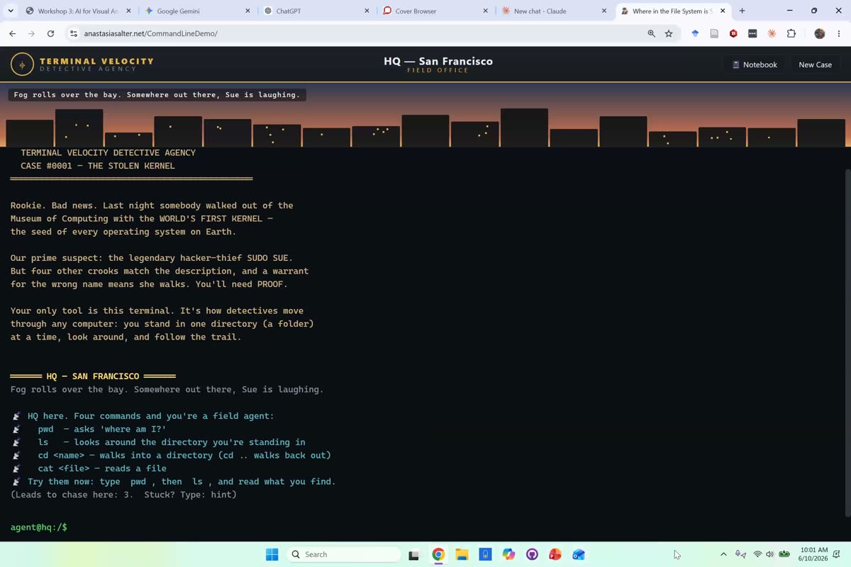
As has become the pattern in this series, Salter opened with a quick tour of what had shipped since the last session, this time a new high-capability model they referred to as “Fable 5.” Rather than describe it, they demonstrated: a Carmen-Sandiego-style game that teaches the command line, generated from a single prompt.
“I asked it to build a game inspired by Carmen Sandiego to teach the command line.”
The point was less the game than the effort-to-output ratio, which they framed against Simon Willison’s running pelican-on-a-bicycle benchmark and the write-ups from Ethan Mollick and Willison.
“What’s most impressive about this one is what it can do at low effort… what it can do at low effort is better than what most models can do at high effort.”
Both generation and analysis as data visualization
Before touching a single image, Salter set the frame that would hold the whole session together. Generation and analysis look like opposites, but they said the reason for treating them together is that they are the same kind of thing.
“The reason we’re conflating these two things is because they’re both forms of data visualization.”
Seeing a generated image as a visualization, they argued, separates it from questions of artistic practice and clarifies what is actually happening under the hood.
“So the story of image generation is really just a story of data and metadata.”
“Professor style” and “make it more”
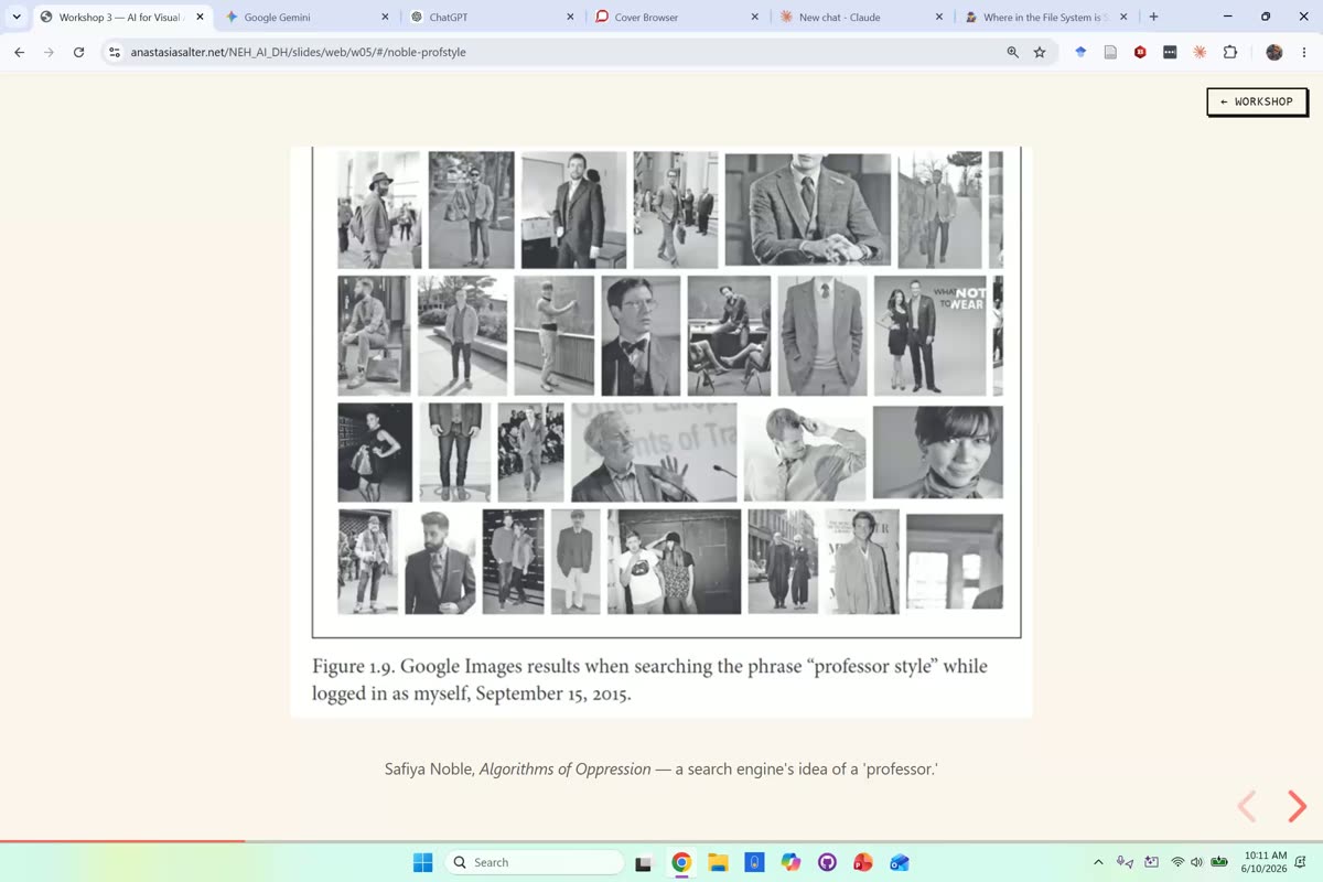
The bias chain began where Salter said they always like to begin pedagogically, with Safiya Noble’s work on search as a flattener of culture and the “professor style” search results from Algorithms of Oppression.
“Pedagogically, I always like to start with Safiya Noble and the search engine.”
From there the group requested a photorealistic professor across ChatGPT and Gemini and watched the tools converge on the same figure. Participants ran the prompts on their own accounts and reported the results live in chat: a pipe-smoking professor, a Soviet-general look, a lecture-hall white man, then a white woman, then academic regalia, and one participant’s wry nod to a real professor of African Studies as an echo of what the tools produced. Salter then demonstrated the “make it more professor” iteration trick, pushing the same image further and further until it drifted into a wizardly Dumbledore-Gandalf figure. The value of the exercise, they said, is that it exposes the model’s underlying idea of the category.
“You’re pushing at the actual data structure underlying it. You’re pushing it to make its definition of professor more visible.”
Two observations landed the point. On what the drift reveals about the data:
“There’s far too much Harry Potter and Lord of the Rings fan art in these data sets.”
And on what stays fixed while everything else shifts:
“White men don’t get demoted to adjunct.”
“Draw my life”
The next warm-up turned the lens on the user. Salter asked a tool to draw what it thought their current life looked like and generated a live self-portrait, an image of a person in their early forties at a cluttered academic desk. Beyond the humor, they framed it as a teaching tool for students who have been leaning on AI, a way to make personalization concrete.
“It’s also an excellent one to use with students who have been using an AI tool a lot, because it can be a way to face just how much information you’ve given it, and how it visualizes that information.”
The trade-off is real: the richer the picture, the more the account has been fed. When a participant noted the tool had guessed an age from CV data, Salter agreed that some inference was unavoidable, and they spelled out the setting that governs it.
“So if you’ve not enabled memory settings at all on Claude, then you’ll both get worse results, but you will avoid this particular bit of data.”
No neutral image: Toys in Iraq
The exercises built toward a single claim: there is no neutral image. The repeated white-man-for-“professor” result is not an absence of perspective but a specific one presented as the absence of one.
“There is always a point of view in each one of these images. The fact that we’re getting a generic white man with a certain facial hair pattern over and over again out of professor. And that is being presented as neutral, and as default.”
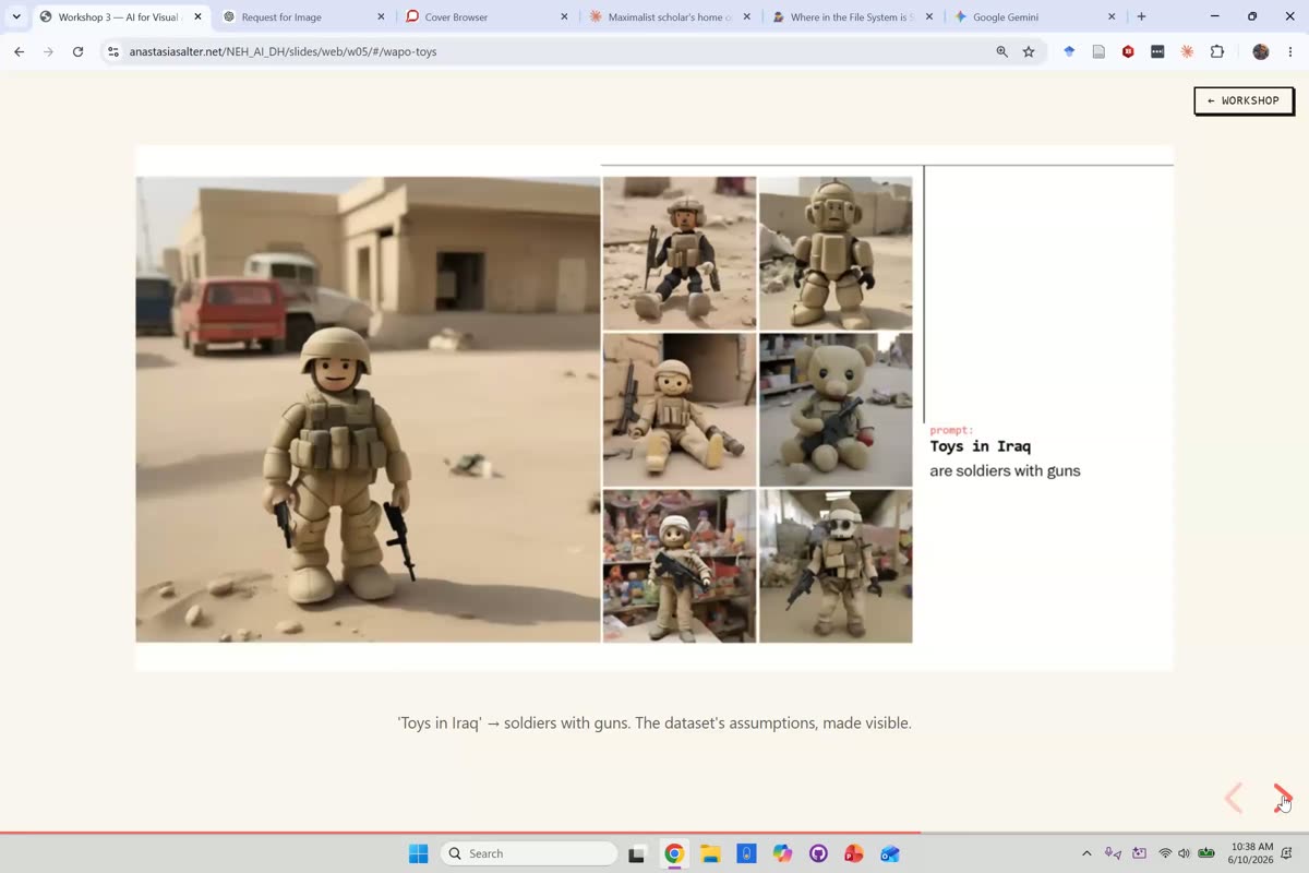
To show the stakes beyond the classroom, Salter pulled up the Washington Post’s “This is how AI image generators see the world” interactive, where the prompt “Toys in Iraq” returns armed soldiers. The danger, they noted, is that generated images increasingly hide their own construction, which makes them more useful for disinformation, not less.
“The fact that you can’t see the seams as easily as you could here also makes it far more alarming for disinformation.”
An in-room participant’s observation about how photojournalism has long depicted certain regions only through poverty or conflict fed directly into the point, which Salter restated on mic.
“All sorts of choices that are made in photojournalism carry into what’s then available and replicated by the generator.”
Generic to specific, and the ethics question
The last warm-up asked tools to “illustrate a neighborhood,” and the defaults came back strikingly uniform: a suburban American street, often with a flag. That sameness, Salter said, is exactly the teachable moment.
“That sameness is exactly what we’re looking for when you have a class full of students try this. It’s very telling what the default metadata for neighborhoods says.”
When results varied between participants, the cause was usually personalization rather than the prompt. A participant’s tests on a “Hispanic neighborhood” prompt returned visibly older cars and a mug bearing profanity, a good illustration of how account memory and per-model guardrails shift outputs. Salter tied the variation back to the account.
“So, that probably reflects a preference that’s been encoded in the memory of your account. And that’s one of the parts of this that’s where we get into that individual influence on a generic data set.”
A participant asked what AI ethicists propose as a fix, and a rich theoretical exchange followed, including one participant’s use of Hardt and Negri’s Empire to name the double bind of representing marginalized groups (the pull toward the average on one hand and toward the stereotype on the other). Salter offered the bluntest solution first, that one option is simply not to use these platforms to generate images of people, then used Google’s 2024 Gemini episode to show why guardrails alone fail.
“Google got in a lot of trouble with Gemini because they actually tried to make it so it would always have diversity in the people represented as outputs. Problem with that was, you could ask it to draw Nazis, and it would give you a diverse group of people in its outputs.”
The takeaway was that the problem is structural, sitting in the training data, not only in the filters bolted on top.
“It’s a complicated problem that cannot be fixed with training data or guardrails alone.”
Turning to analysis: alt-text in a Claude Project
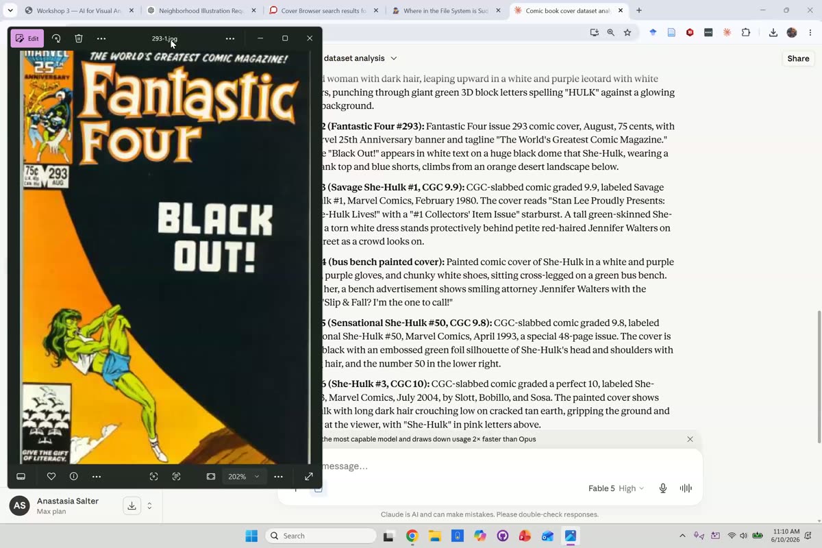
At the midpoint the session flipped from making images to reading them. Salter chose a dataset live, a set of She-Hulk comic covers spanning 25 years, created a Claude Project, and had the model generate descriptive alt-text starting with a Fantastic Four #293 cover.
“We’re going to move into our second half today, which is actually conducting image analysis and thinking about the ways that a multimodal model understands images.”
This, they said, is one of the genuinely practical uses of multimodal AI, given how much of the visual web has no descriptive alt-text at all.
“This is actually one of the most fundamental practical uses of multimodal AI, because the number of things in this world that don’t have descriptive alt text are vast, and its capacity for descriptive alt text is fairly strong.”
The important caveat, consistent with the week’s pedagogical note that AI alt-text is a draft, is that the model is not neutrally reporting what is there.
“One thing to notice about alt text like this is it’s an act of interpretation.”
Visualizing the covers
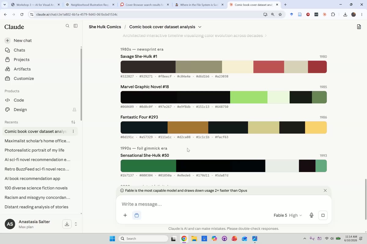
With alt-text in hand, Salter moved to visualizing the set, generating color-palette and greenness-over-time charts across the covers. Everything from here on, they noted, is increasingly a coding task the model handles on your behalf.
“Everything we’re doing from this point on is just more and more and more intensively code.”
They connected the method to real comics scholarship, where tracking a character’s palette over decades is a recognized form of visual analysis.
“In comic studies, we use this type of visual analysis… when we’re looking at how Batman has changed over time… You can watch, literally watch, the blues get darker, and then suddenly it’s all black.”
Applied to She-Hulk, the model’s own generated reading framed the covers as a case study in how American superhero comics negotiated the depiction of a powerful woman across 25 years, a reading a participant sharpened with the observation that the character is allowed strength only so long as she stays beautiful.
Building the Artifact, and meeting Cowork
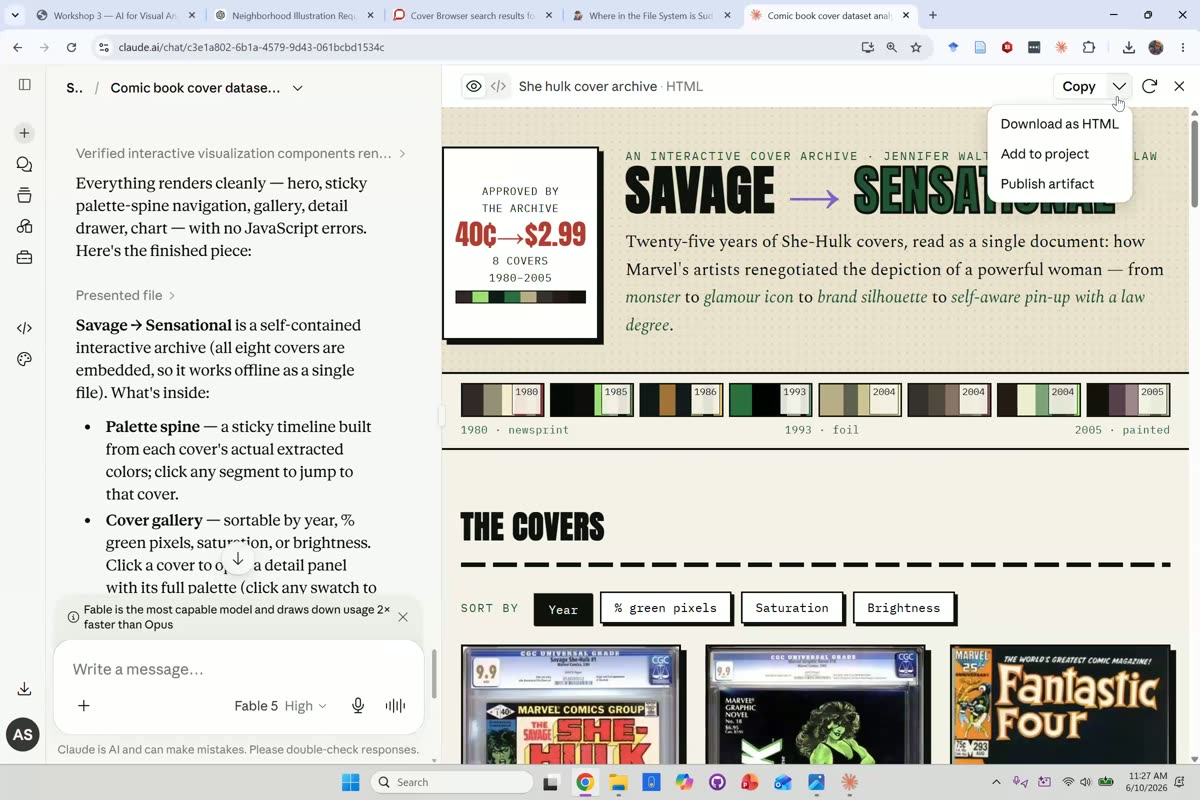
Salter then asked the model to build an interactive Artifact from the cover set, using the new Fable model as a live test of whether the pricier tier earned its keep.
“I haven’t tried this prompt with Fable, so now I’m excited to see if it does better.”
“There’s probably no reason to pay for Fable, but it’s interesting for me to try to figure out if there is, in fact, any reason to pay for Fable.”
While the Artifact built, Salter introduced Claude Cowork and led with the security warning rather than the features. Cowork can act on the files in a real folder, which means the folder is fair game.
“Always, always run it in a subfolder where you have reviewed all of the contents, backed it up if it’s anything important to you. Because it can, and will, randomly delete things, if it decides that’s what you meant.”
Their standing rule for keeping a human in the loop:
“I recommend… never hitting always allow. So that you always have to think about it a little before you send it off in this direction.”
The upside is that Cowork lifts the size ceiling a Claude Project imposes.
“Cowork is a lot like a project. The main, most important difference is we are no longer restricted to what we can fit in Claude.”
The finished Artifact arrived: an interactive “Savage to Sensational” cover archive.
Cowork at scale: a fleet of sub-agents
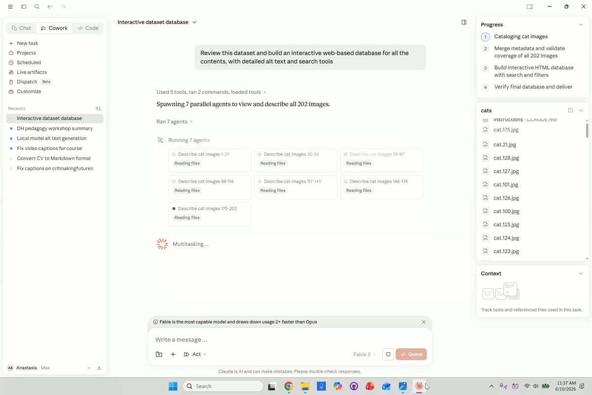
To show what the size ceiling actually buys, Salter switched to a 202-image cat dataset from Hugging Face and turned Cowork loose in a mode that acts without pausing to ask. They were candid about what Cowork really is.
“Cowork is basically just Claude Code for people who don’t want to face the fact that what they’re doing is code.”
Rather than describe the images one by one, it spawned parallel workers.
“It’s got 7 agents running right now… deployed a fleet of agents to go out, instead of trying to describe all 202 images in sequence.”
That parallelization, they explained, is the reason large-scale work is becoming practical.
“It’s this type of parallelization and the use of what we call sub-agents that is part of why doing work across large data sets is becoming more and more feasible.”
A brief tour of Cowork’s settings followed (usage limits, global instructions, connectors, and network permissions), with two cautions. Every instruction layer costs tokens, and letting the tool reach the internet is powerful but worth watching.
“Once you’re working with Cowork, you can allow it to go on the internet, install packages, and access domains. And that will make it much more useful for you. But you’ll want to monitor when it’s doing that to make sure you’re happy with the decisions it’s making.”
The cats database
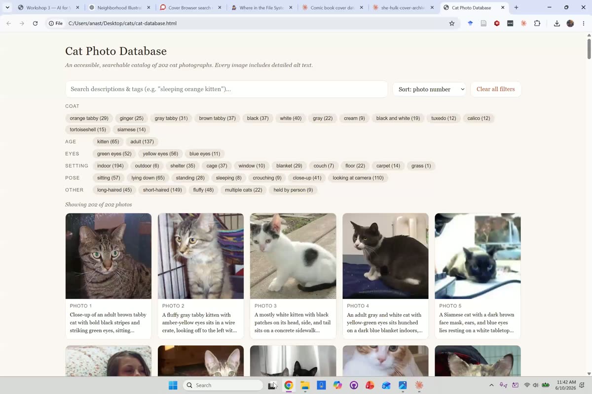
The run produced a searchable, filterable HTML gallery of all 202 cats, tagged by coat, age, eyes, setting, and pose. Salter used it to make the case for working at real scale rather than with a token sample.
“The main reason to work with Cowork for this task is to avoid the frustration of just doing something that’s a performative sample. Because you can instead work really efficiently across a giant project this way.”
The dataset came from Hugging Face, which they flagged as a resource the series would return to.
“I highly recommend Hugging Face… Hugging Face is kind of the giant open source AI community.”
Where this fits: the unglamorous uses
Salter was frank that the most valuable Cowork tasks are often the tedious ones no one is funded to do.
“Often, what I use Cowork for is the things that no one will pay staff to do. It’s amazing at taking your travel authorization form, taking that same information, and putting in 3 other versions.”
One example was fixing proper nouns in course-video captions, where Cowork pulls the relevant names from the slides and syllabus to correct what automatic captioning mangles.
“It actually pulls the slides from the video, for names, as well as anything it needs from the syllabus.”
(The demo frame for this beat was left out of this recap for privacy, since the file sidebar showed a colleague’s name.) Participants offered their own: a technical-theatre portfolio of 25 to 35 images sorted correctly by production with generated alt-text and captions, and curatorial alt-text that the participant judged largely on point. The honest caution came with the recipe-transcription example, where the model invented content for the oldest, hardest-to-read pages. On those archival gaps, Salter named the risk plainly, echoing the week’s note that AI accelerates a draft while human curation remains the work.
“Those sorts of gaps are opportunities for invention.”
Close reading: what the model saw, and invented
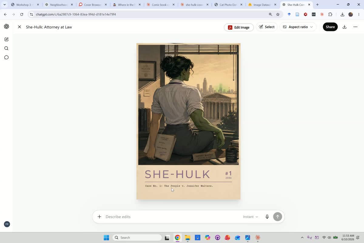
Near the end, Salter turned a critical eye on one of the model’s own outputs, closely reading a generated She-Hulk cover description. Even with a detailed prompt, they observed, the output is not a clean rendering of the instructions but an interpretation with additions the prompt never asked for.
“So this image includes interpretation and elaboration by the other model. It is not simply… even in this case, with the detailed prompt, it is not simply a realization of that prompt.”
The tell was a small invented detail:
“Once there is a desk, apparently there must be a novelty coffee mug. And I blame Instagram for that.”
Copyright guardrails, revisited
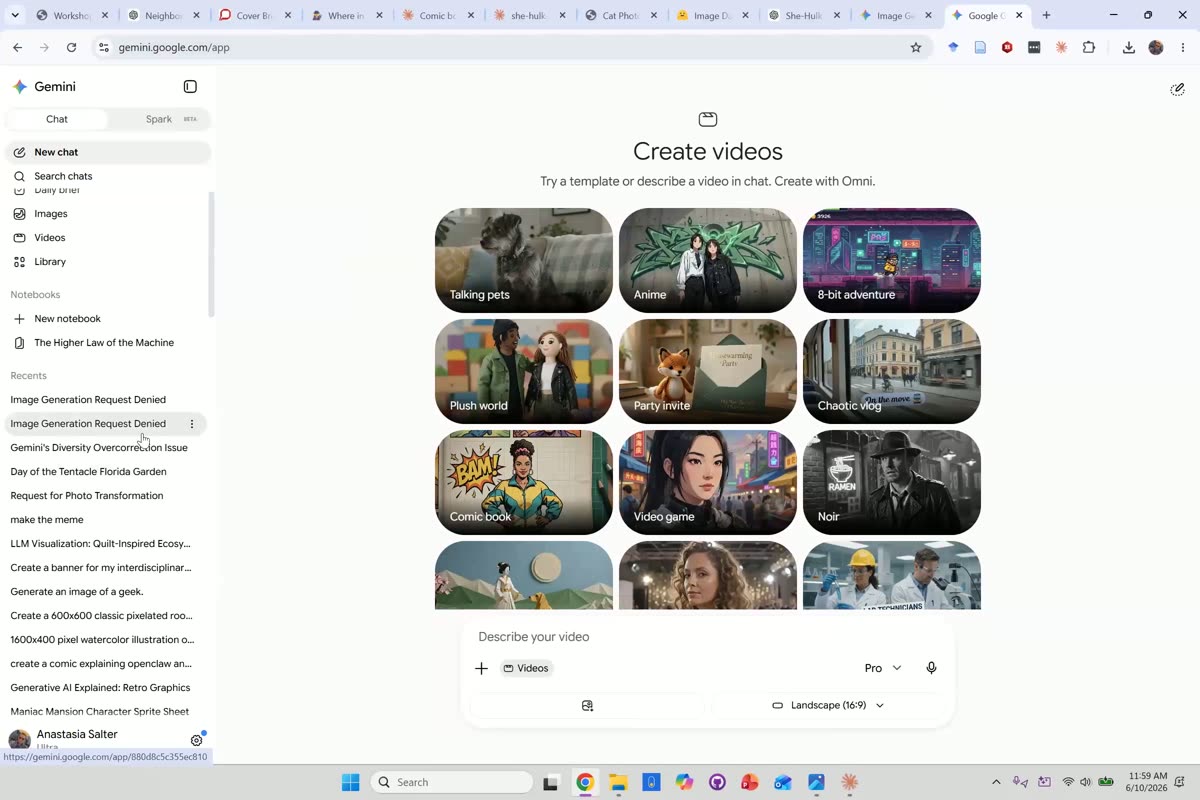
Returning to the copyright thread from the first half, Salter tested it in practice by trying to generate a She-Hulk image and running into refusals that fired unpredictably.
“Hitting these guardrails is incredibly inconsistent.”
The line between blocked and allowed, they noted, is a moving target, and often a matter of how directly a trademark is named.
“I feel like we could ask it to add a Marvel logo, and we’d probably get in at this point.”
Closing and the week’s async
Salter closed by pointing to the asynchronous follow-up, an invitation to keep playing with both halves of the day.
“The async for this week, we’ll be playing around more with images. You can decide whether you want to play around with the image generation, look at some of these copyright guardrails.”
Their strongest recommendation was to get comfortable with Cowork, with the security lesson attached.
“The one I most recommend you kind of spend time with is Cowork. It’ll get you used to working with that type of workflow. Just be aware of where you run it, and keep in mind the security considerations when we go into it.”
And a parting rule of thumb on context, that more is not better:
“You’re picking just enough information. You don’t want to overwhelm it with lots of stuff, because it’s actually more likely to go off track.”
Try It Yourself
Missed the session, or want to run the workflow on your own images? The Week 5 page walks through it: upload a five-to-ten image set to a Claude Project, generate alt-text and a metadata table, ask Claude to surface patterns and build an Artifact that visualizes the set, then critique what its vision flattens or invents. If you have access, try the same workflow at scale in Claude Cowork. See the Core Exercise on the Week 5 page to try it yourself.
Quotes are drawn from the session transcript, lightly edited to remove filler words and false starts, and to correct obvious automatic-captioning errors (for example “Sophia Noble” → Safiya Noble, “clawed code” → Claude Code, “cloth” and “the cloud” → Claude, “and its outputs” → in its outputs, and “the other mom” → the other model) to the words the speaker actually said. Participant comments are paraphrased without attribution.